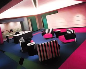
 I understand that the eighties are kind of an unpopular period as far as design goes, or at least it has been. As that decade recedes ever-further into the past, that may well be changing, but there’s still a sense of people regarding it as low on class. Despite that, I’m determined to swing the board in favour of an eighties-style office reboot.
Why, you ask? Well, the office interior is being renovated anyway, so I figure a change of overall vibe is in order alongside the new layout. And it might as well be eighties-inspired, seeing as that period was (in my view) the absolute apotheosis of office design. For Melbourne workplaces in particular, the translation into the present should be seamless, and it’s long overdue.
It’s a sharp, bold look that many people dismiss as merely corporate, without regard for the fact that this design sensibility was popular in that sphere for a reason. It’s energising, dynamic and defined, and promotes a sense of ‘thinking big’ that many businesses today strive for. It’s also well suited to bounce off the whole 21st century thing of ‘office as playground’, due to its strong colour palette, graphic shapes and material choices reminiscent of kids’ play equipment.
That’s my elevator pitch, anyway. While I’m no commercial office fitout expert, Melbourne offices are within my realm of expertise, at least as a user . That’s why I think I’m at liberty to give my opinion on this. I’ve been frequenting corporate work environments since the eighties, and I can assure you that those really were the days as far as interiors are concerned.
Sure, the technology of today is nothing to be sniffed at, but that can be integrated into this aesthetic. It’s almost as though technology has finally caught up to the forward-looking vision of the eighties, and now is the time to fully realise it.